 |
One sheet vintage
London Underground poster from around 1928. It is a masterful example of early 20th-century information design used for corporate reassurance and marketing.
During this era, under the leadership of administrator Frank Pick, the London Underground (then known as "The Underground") became a pioneer in using high-quality graphic art and data visualization to build public trust.
The "Exaggeration" Trick
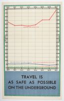
The most fascinating part of this poster is its clever use of scale to make a statistical point. Look closely at the labels for the blue and green lines:
Red Line: Shows the total "Service Car Miles Run" (climbing toward 80 million).
Blue & Green Lines: These represent equipment failures and accidents. Crucially, the poster notes these are "ON A SCALE EXAGGERATED 1000 TIMES."
By magnifying the negative data by 1,000 and showing that it still barely registers at the bottom of the chart compared to the total miles traveled, the designer creates a powerful visual argument. It tells the commuter: "Even if our accidents were a thousand times worse than they actually are, they would still be a tiny fraction of our total service."
Historical Context
Safety Campaign: In the late 1920s, the Underground was expanding rapidly. Public anxiety about "modern" high-speed travel was common, so posters like this were designed to provide "scientific" proof of safety.
The Baynard Press: The small text at the bottom suggests it was printed by The Baynard Press, a famous London printing house that worked closely with the Underground to produce its iconic Art Deco and modernist posters.
Data Period: The chart covers the years 1920 to 1927, showing a post-WWI boom in service miles as the city recovered and grew. |
|
|